Role: UX/UI
I was the UX/UI designer on the team alongside 2 developers, 1 marketing manager,
1 visual designer / UI designer, 1 project leader and the founder.
1 visual designer / UI designer, 1 project leader and the founder.
Timeline: 3 years (Mars 2020 - Mars 2023)
Tools:
- Adobe XD, Illustrator, Photoshop, After Effects
- Zeplin
- 3D software Blender
- Google Analytics
- Looker Studio
Background
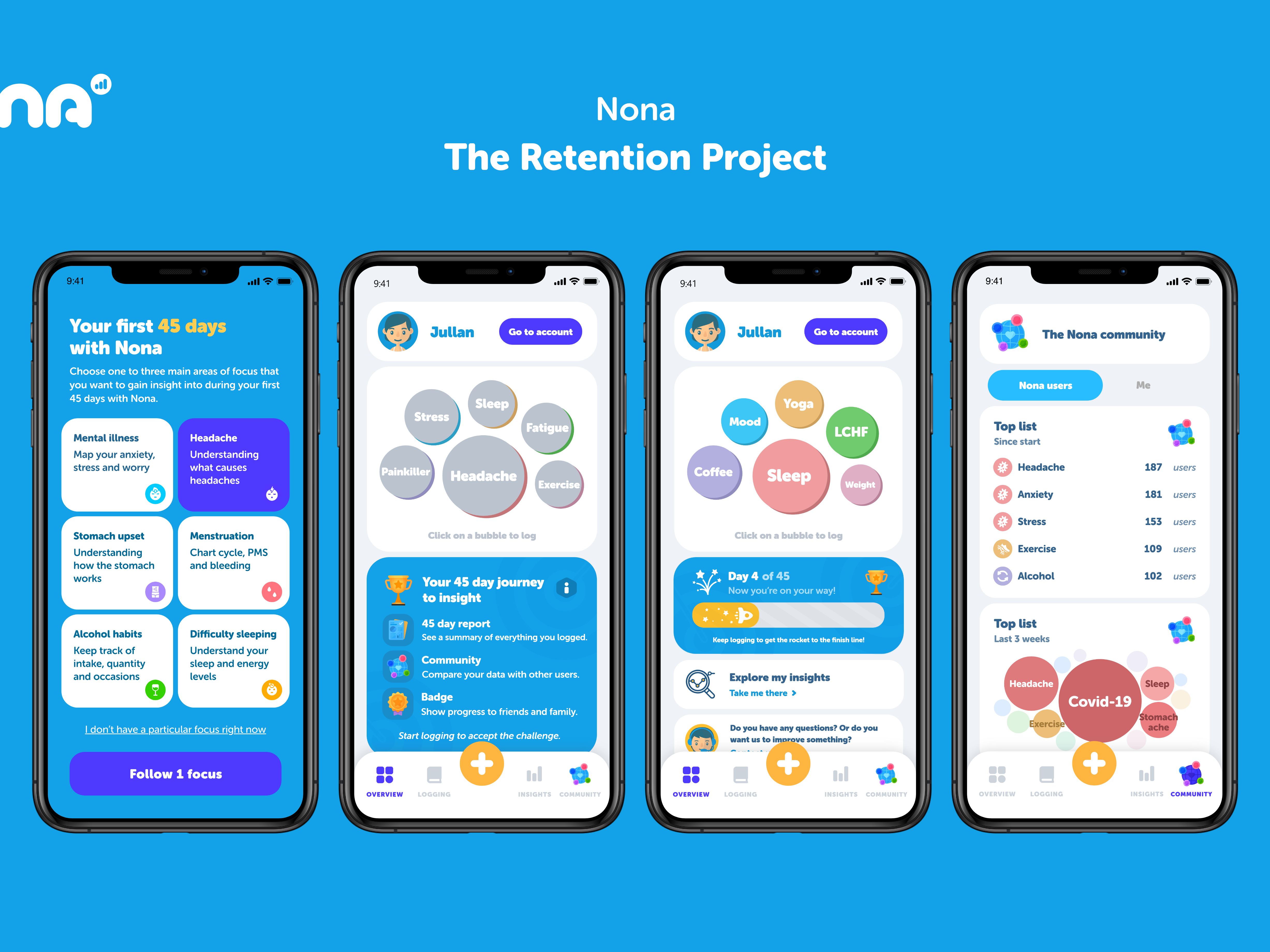
Nona is a health-oriented iOS app focused on improving people’s lives by showcasing and discovering patterns among many different kinds of user data. Nona allows users to track and record their health data in a customizable notebook format. While it offers various features, it is not designed to directly compete with specialized health apps such as those for menstruation or fitness.
I joined the Nona team to assist with the UX design as they were developing the app into a final product and adding more features. At the time, there was already a visual/UI designer on the team whom I worked closely with, and eventually, I took over the UI design responsibilities as well.
Some of my key tasks were:
- Conducting research on potential features
- Design features based on ideas from the team
- Determining how to integrate features into Nona, both new ones and improvements to existing ones
- Building prototypes
- Creating UI components
- Design features based on ideas from the team
- Determining how to integrate features into Nona, both new ones and improvements to existing ones
- Building prototypes
- Creating UI components
Users
During the development of the app, our user group consisted mainly of the team, our friends and family. Although this group was relatively small, it included individuals of varying gender, age, family status and health-related focus points. Continuously receiving feedback from users who used the app in their daily life helped me to refine, improve and create new features for the app.
I maintained a critical and open mindset toward all feedback since we, as the creators, were biased users.
User testing
Throughout the employment I continuously conducted preference testing on my colleagues. I also conducted a few usability tests.
Design process
When I am assigned a task, I am analytical and consider different paths, taking into account various user cases and needs. From there, I come up with multiple options or solutions to discuss with the team. I also take into account what is feasible for developers, breaking down complex problems into manageable MVPs that can be built into scalable solutions.
Depending on the task at hand, my design process could vary. However, in general, I followed the following process:
1. Determine the task
A task was formed by someone on the team who had:
- identified a problem with the existing design
- found something in the app that could be improved
- suggestions for a new feature
- found something in the app that could be improved
- suggestions for a new feature
After the team prioritized the task, I took responsibility for looking into it and presenting potential solutions to the team.
Some examples of tasks were:
- How can we integrate a family section into the app?
- How can we improve the home view?
- How can we make it easier to log?
- What kind of charts do we want and what should they include?
- How should we implement push notifications?
- What new symptoms/diseases should we implement and what should they include?
- How can we improve the home view?
- How can we make it easier to log?
- What kind of charts do we want and what should they include?
- How should we implement push notifications?
- What new symptoms/diseases should we implement and what should they include?
2. Break down the task
To begin, I first identified which specific cases the task was intended to solve. This involved carefully reviewing a range of different scenarios and determining the key questions that we wanted to address. Once I had a clear understanding of the cases that needed to be considered, I then compiled a list of problem statements that summarized the challenges we were looking to address.
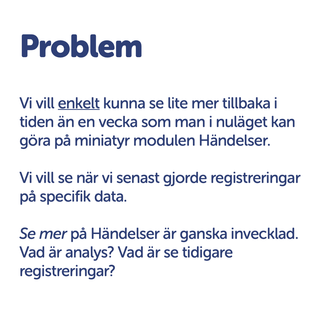
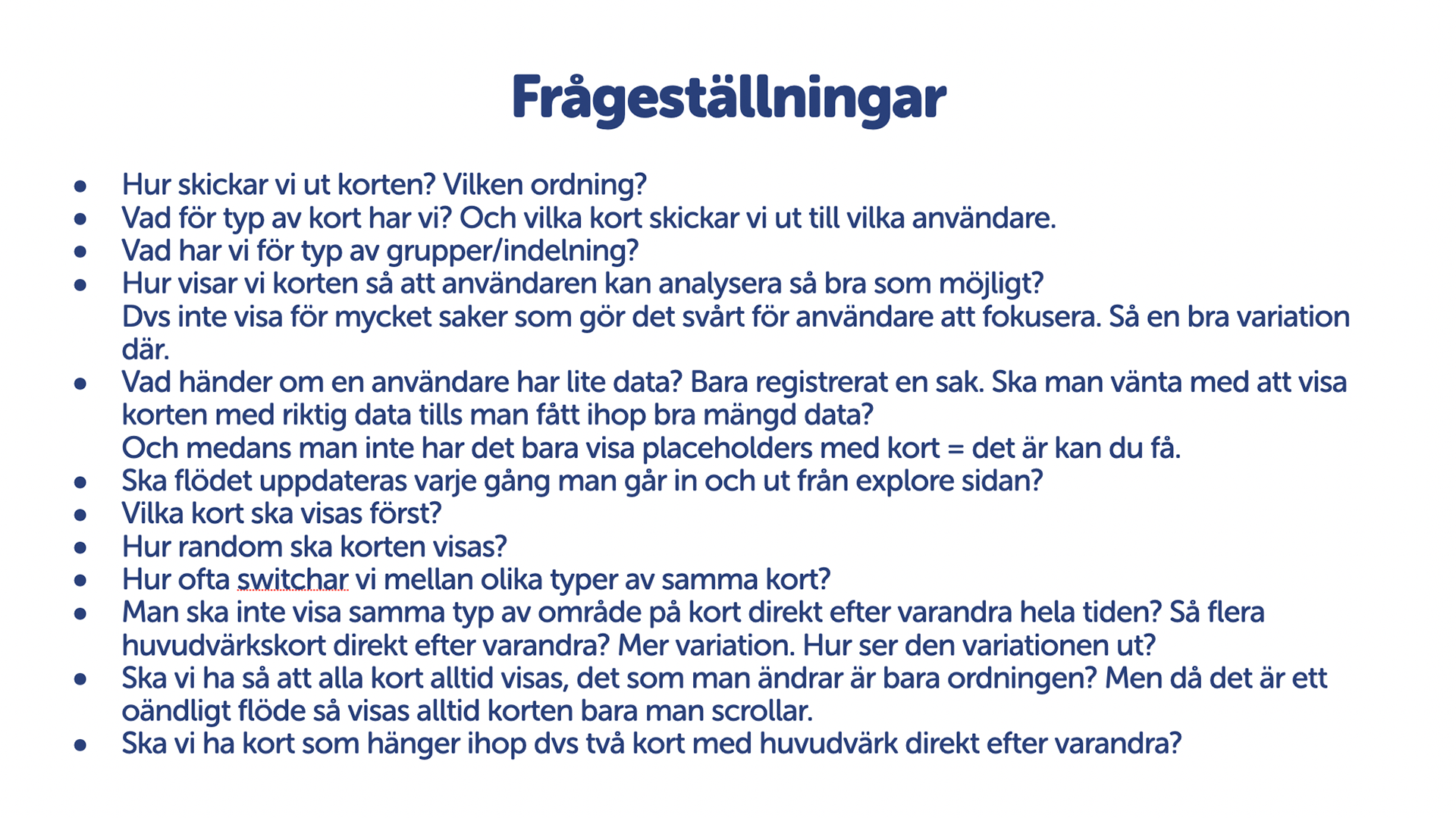
These images are from two presentations where I concluded different problem statements.
3. Design the task
Before designing the task, I conducted research by reviewing other apps and design reference libraries to gain inspiration. I also browsed the internet for best practices and additional resources.
Throughout the design process I created a lot of different prototypes, both low and high fidelity, that were either interactive or non-interactive. I also held regular brainstorming workshops and presentations for the team and stakeholders. I was careful to ensure that these presentations were accessible and easy to follow so that all participants could fully understand the concepts being discussed.
By soliciting feedback and engaging in an iterative design process, I was able to refine and improve the prototypes until a final design was achieved.
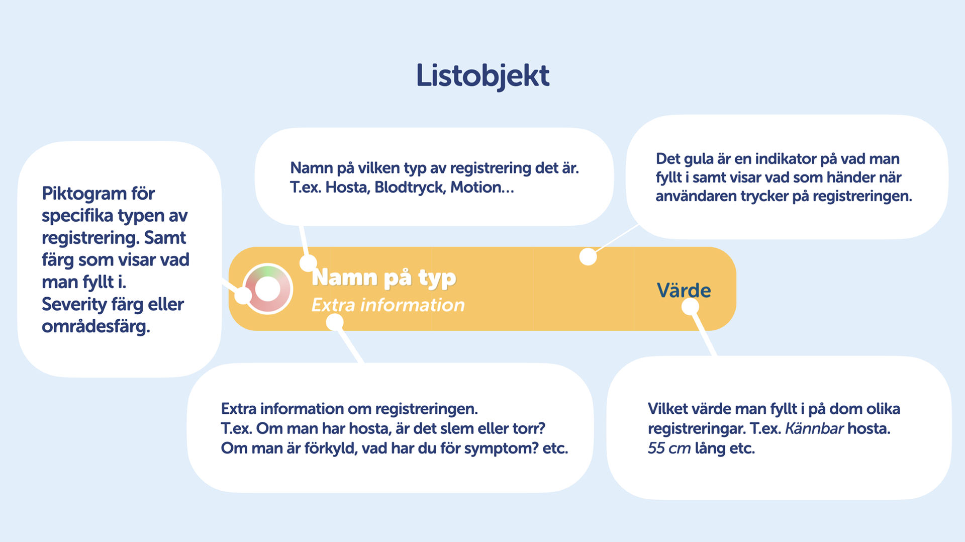
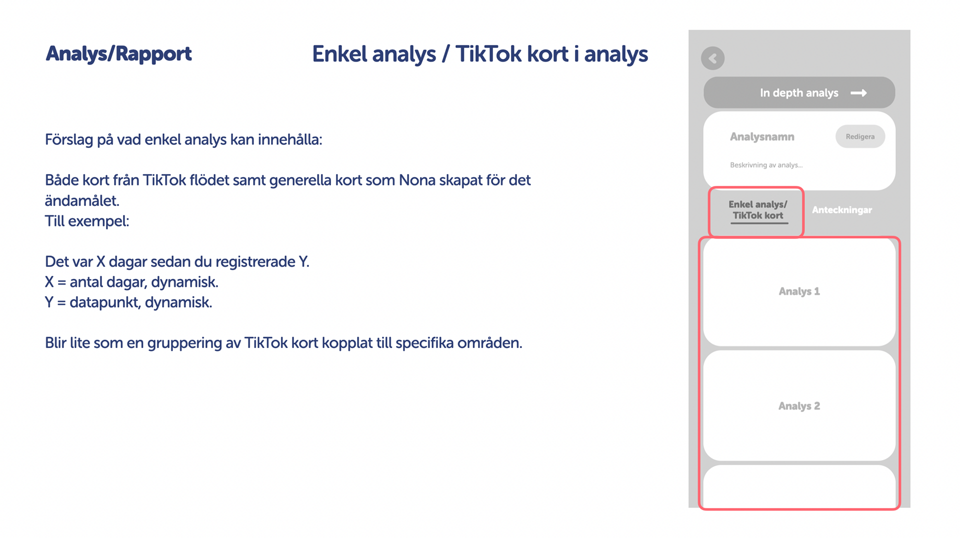
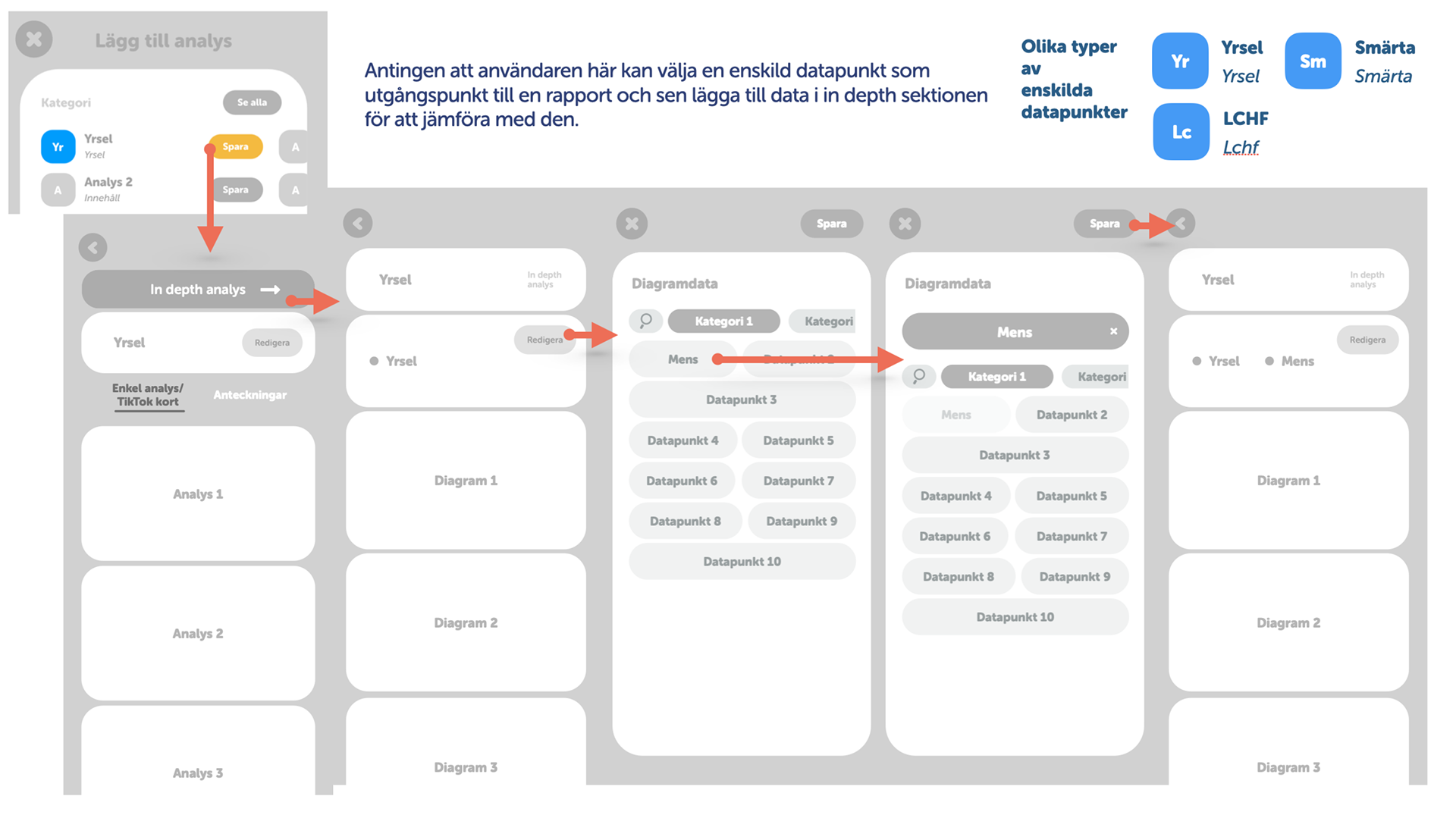
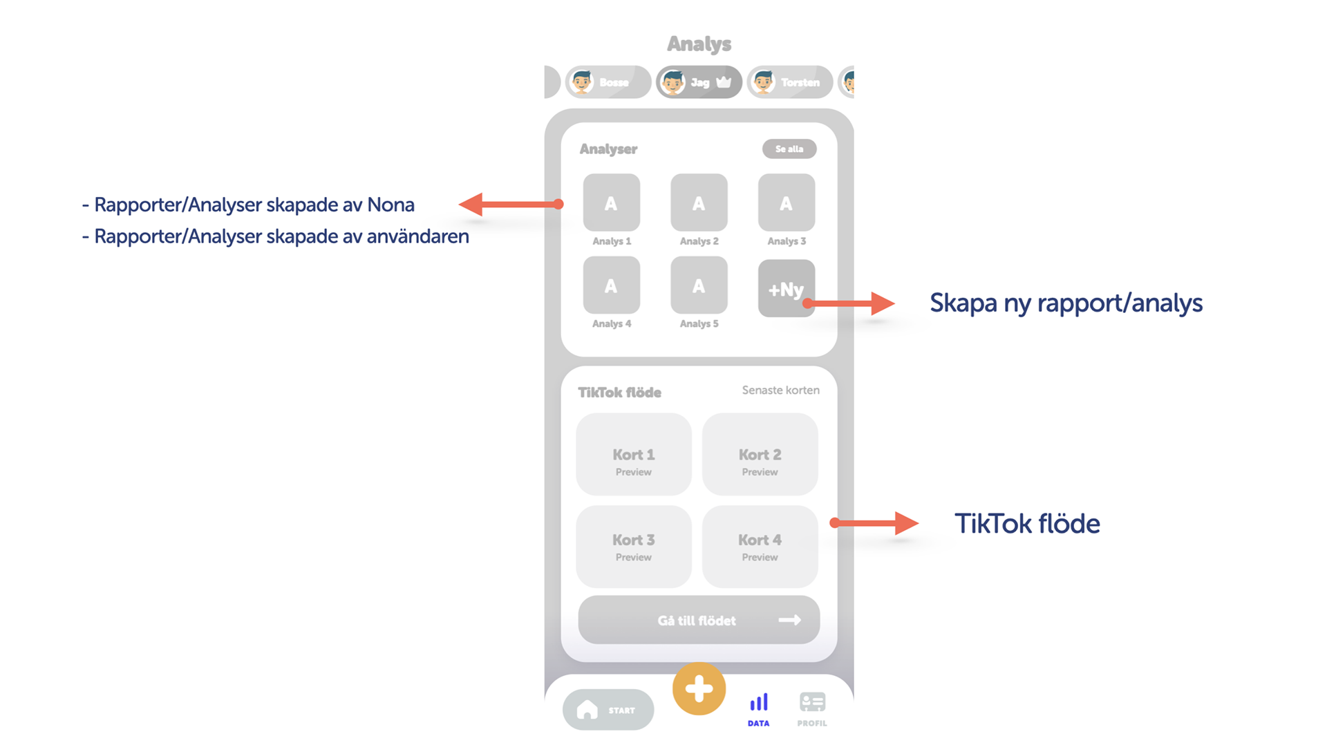
Some screenshots of presentations I held.
3. Finalize the task
After receiving the final feedback, I finalized the project and uploaded the views to Zeplin so that the developers could implement the design.
Style guide
We had a visual designer on the team who designed UI components and created our own UI icon library. I mostly created UI components based on his visual designs and I also created a lot of icons following the guidelines for our own UI Icon library. Additionally, I created some marketing materials for Nona.
Iconography
Some of the icons I created for our UI Icon library.
I created the Icons in Adobe Illustrator and XD.
I created the Icons in Adobe Illustrator and XD.
Icons I created inspired by gamification / 3D illustrations.
UI components
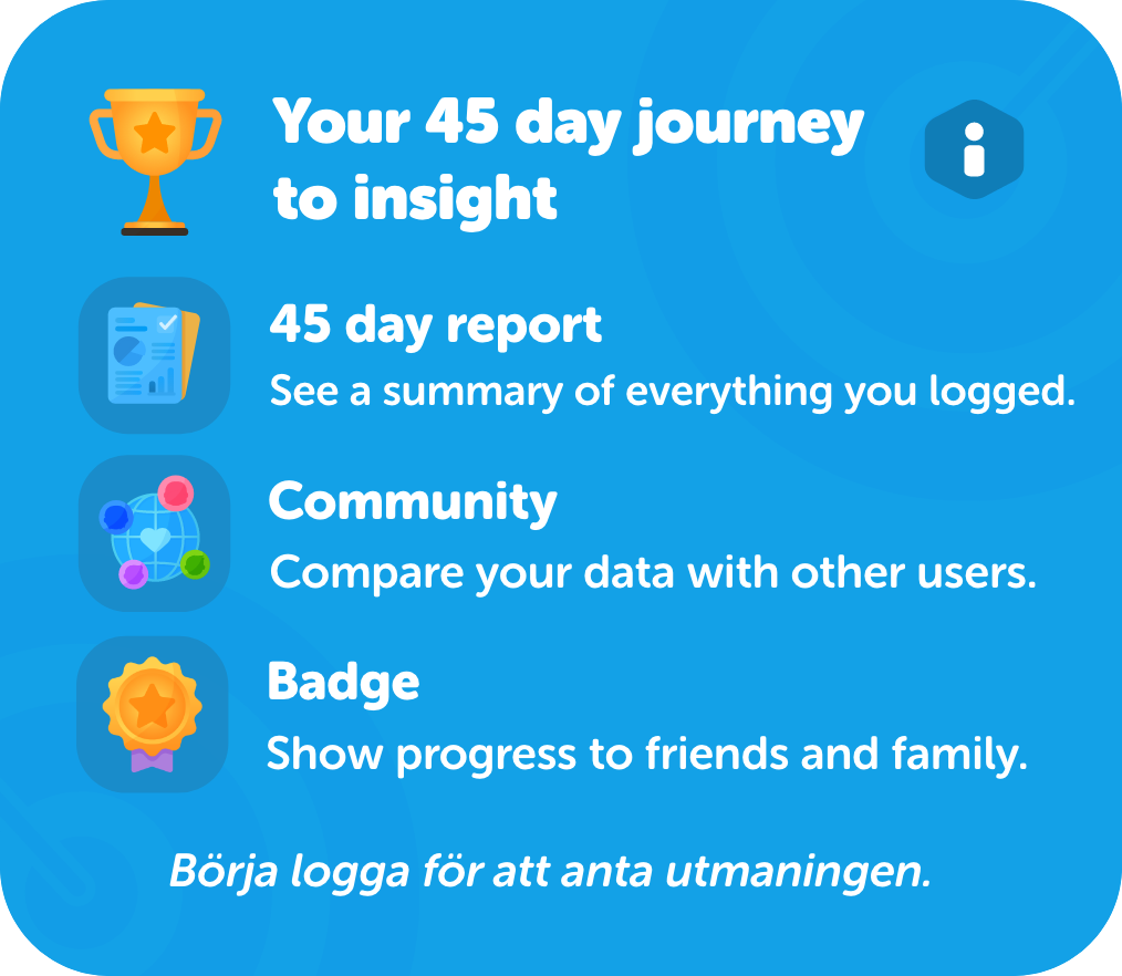
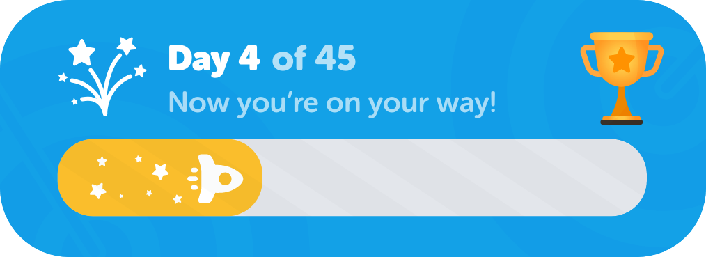
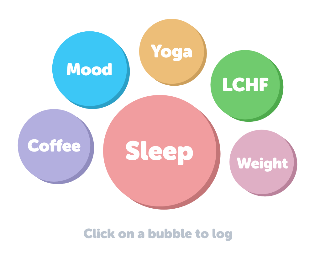
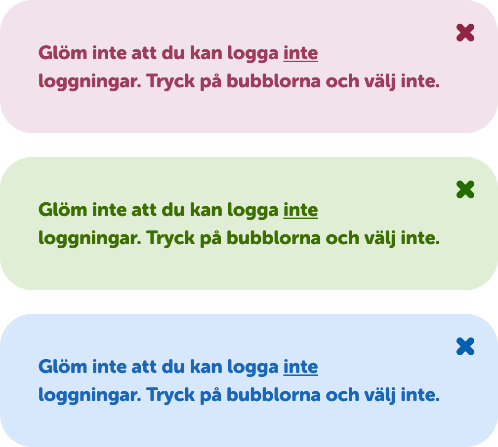
UI components I created inspired by gamification / 3D design.

Graphic design / 3D design
I created our App icon and assets for our website and marketing material.
Tools: Blender, After Effects, Adobe XD
Inspiration
App store content
Assets to website
Final showcase
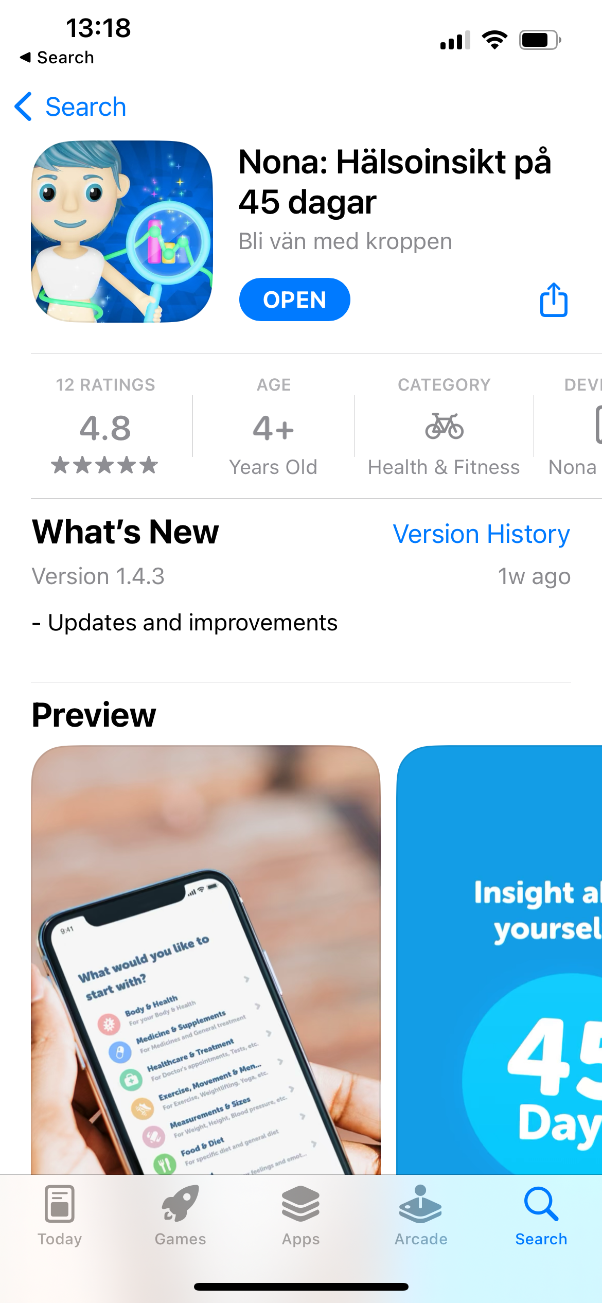
App Store: Nona Hälsoinsikt på 45 dagar
Some key takeaways from this employment
#1 The importance of MVP
I learned that it is important to release an MVP or start testing a product with minimal features so that you can identify and address the biggest pain points early on. By testing on a small scale first and gathering feedback from users or test users, you can make informed decisions about how to scale up the product or improve the existing features.
#2 Follow-up and user testing are key
The importance of follow-up with users and testing the product on a bigger user group, then you can focus on building/improving features that most users want.
#3 Communicate design decisions to non-designers
Since people have different learning styles, it is important to tailor your presentations to your audience to ensure everyone can follow along.
#4 Automate processes
There are a lot of different ways to automate a lot of different steps so that the overall process is more efficient.
If there was more time available:
- Continuously analyze the retention / other diagrams
- User research and identify the biggest pain points
- Find where people drop off and analyze why (started looking at hotJar)

