Regal Cinema
"This project was created as a homework assignment; therefore, the users are fictional. Prototypes and visual styles were developed using Figma, and I utilized the Stark plugin within Figma to ensure compliance with contrast and other accessibility guidelines."
Keywords: competitive analysis, design thinking, accessibility, user research, user personas, user journey maps, sitemap, wireframing, prototyping
Background
Place: Stockholm, Malmö
Number of saloons: 3 in Stockholm, 2 in Malmö
The Regal Cinema shows a large variety of movies in their cinemas.
A person who visits the Regal Cinema is someone who is interested in movies and values a touch of luxury.
He or she also prefers that the focus is on the film, with minimal talking during a screening.
Regal provides their visitors with an enhanced movie experience by offering VIP seats that come with a bar connected to the venue.
Currently, Regal does not have a website where visitors can find and book tickets for their films.
Mission
Create a digital service to increase the number of visitors to Regal's cinemas.
Requirements:
- Easy to find the right movie
- Easy to buy tickets
- Everything must be adapted to the target group's behavioral patterns
Extra:
A person who visits the Regal Cinema is someone who is interested in movies and values a touch of luxury.
He or she also prefers that the focus is on the film, with minimal talking during a screening.
Regal provides their visitors with an enhanced movie experience by offering VIP seats that come with a bar connected to the venue.
Currently, Regal does not have a digital service where visitors can find and book tickets for their films.
Competitive analysis
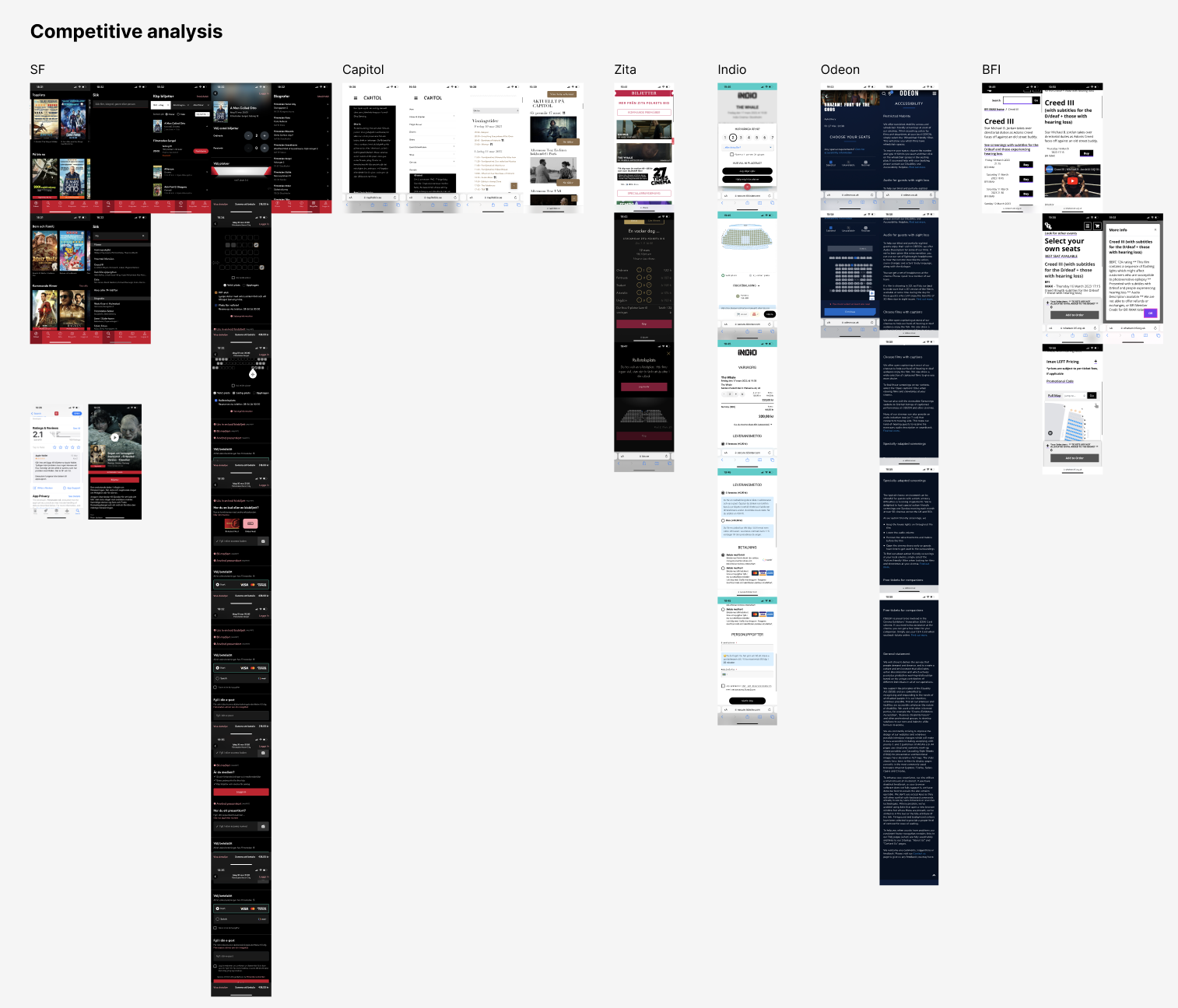
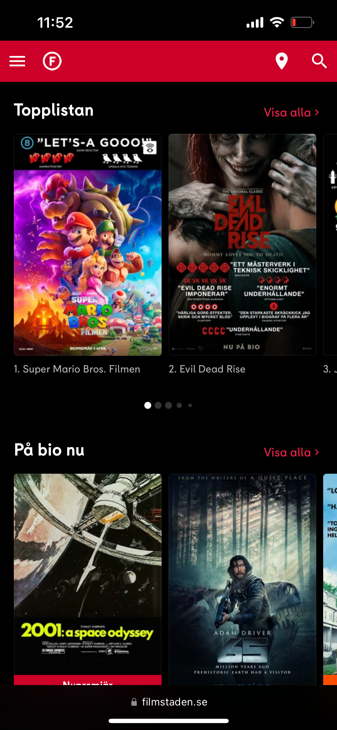
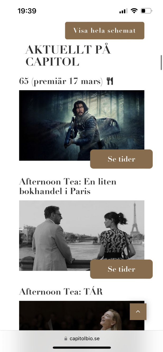
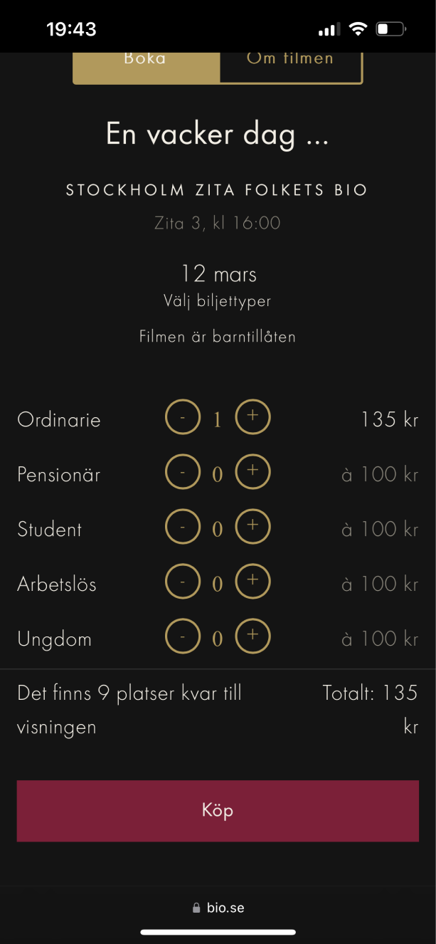
To find strengths and weaknesses with similar products on the market, I started with a competitive analysis.

Design thinking
When working on this assignment, I applied the Design Thinking process.
User research: Define Regal's target audience and understand their needs
Ideation: How should the service be designed to match Regal's target group and their needs
Prototyping: Design prototypes in Figma with the best selection
Test: Test prototypes on users
Accessibility
Throughout the project, I prioritized accessibility in my design.
Here are a few examples of what I considered:
- Clear headings
- Descriptions
- Clear navigation
- Easy to press touch targets
- Size of typography
Here are a few examples of what I considered:
- Clear headings
- Descriptions
- Clear navigation
- Easy to press touch targets
- Size of typography
User research
To get a clearer picture of Regal's target group, I interviewed visitors on-site (Regal's cinema in Stockholm) and online.
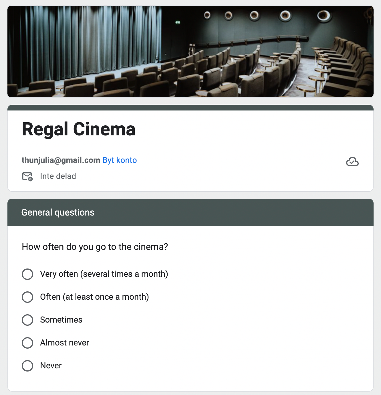
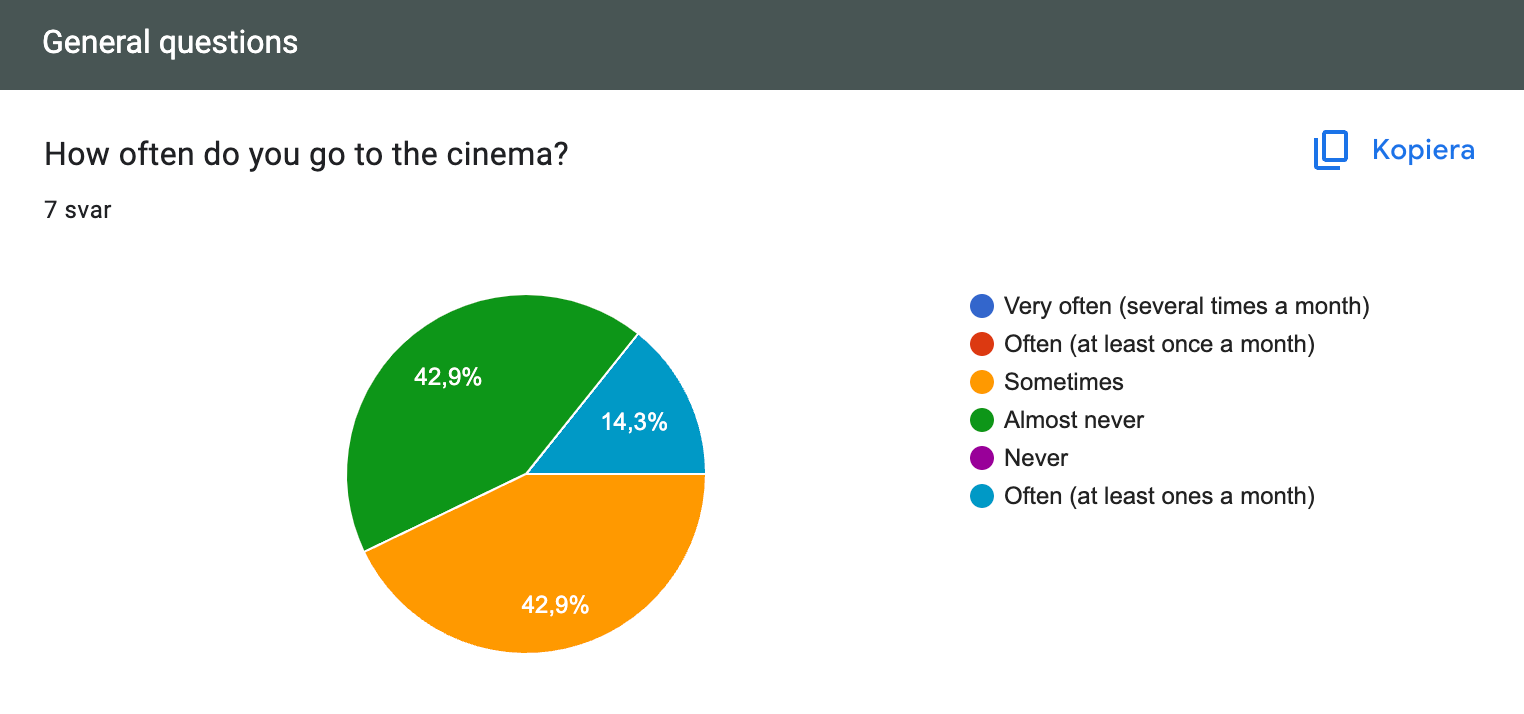
In addition to interviews, I also sent out a questionnaire to gain insight into how visitors think and what is important to them.
In addition to interviews, I also sent out a questionnaire to gain insight into how visitors think and what is important to them.
User personas
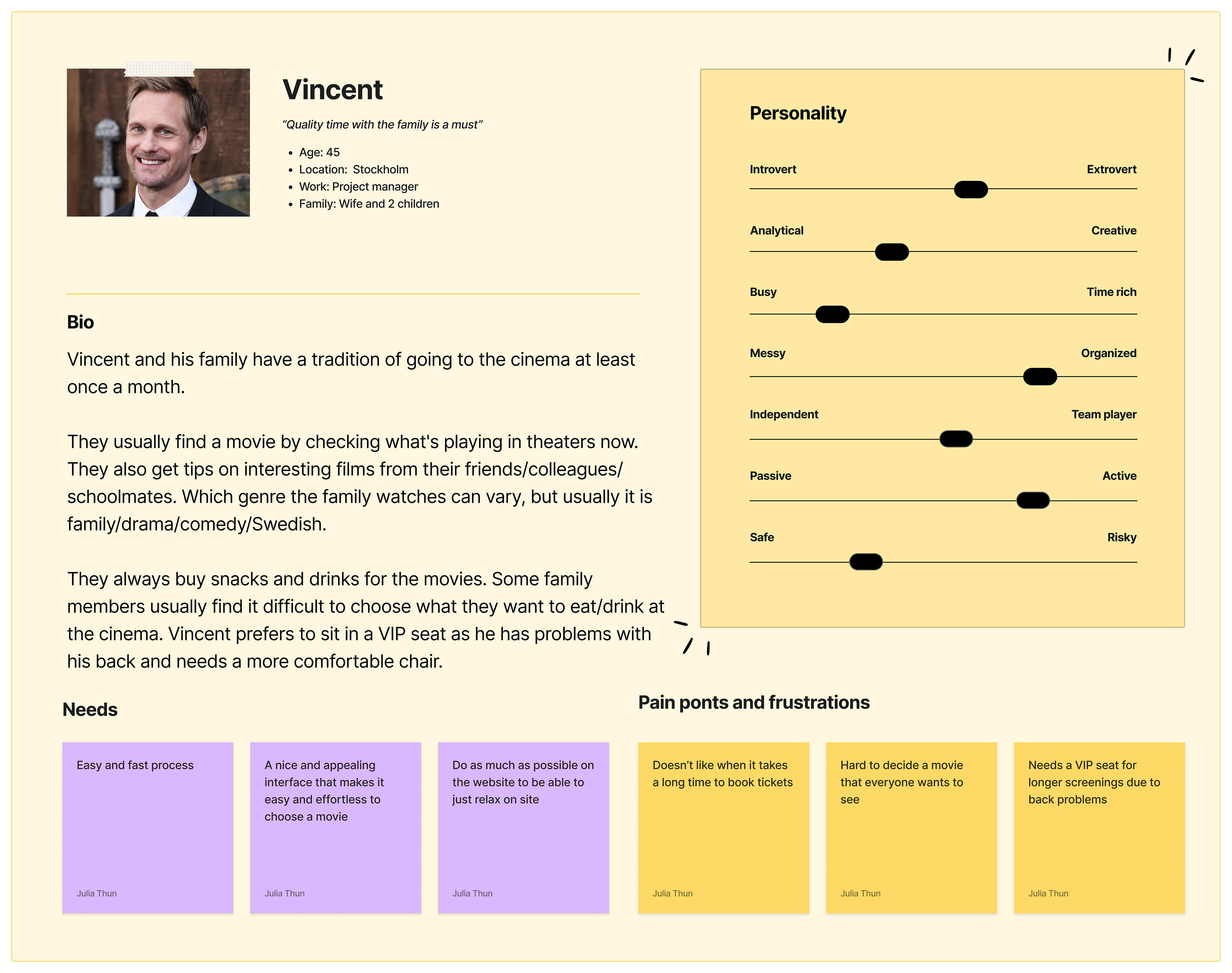
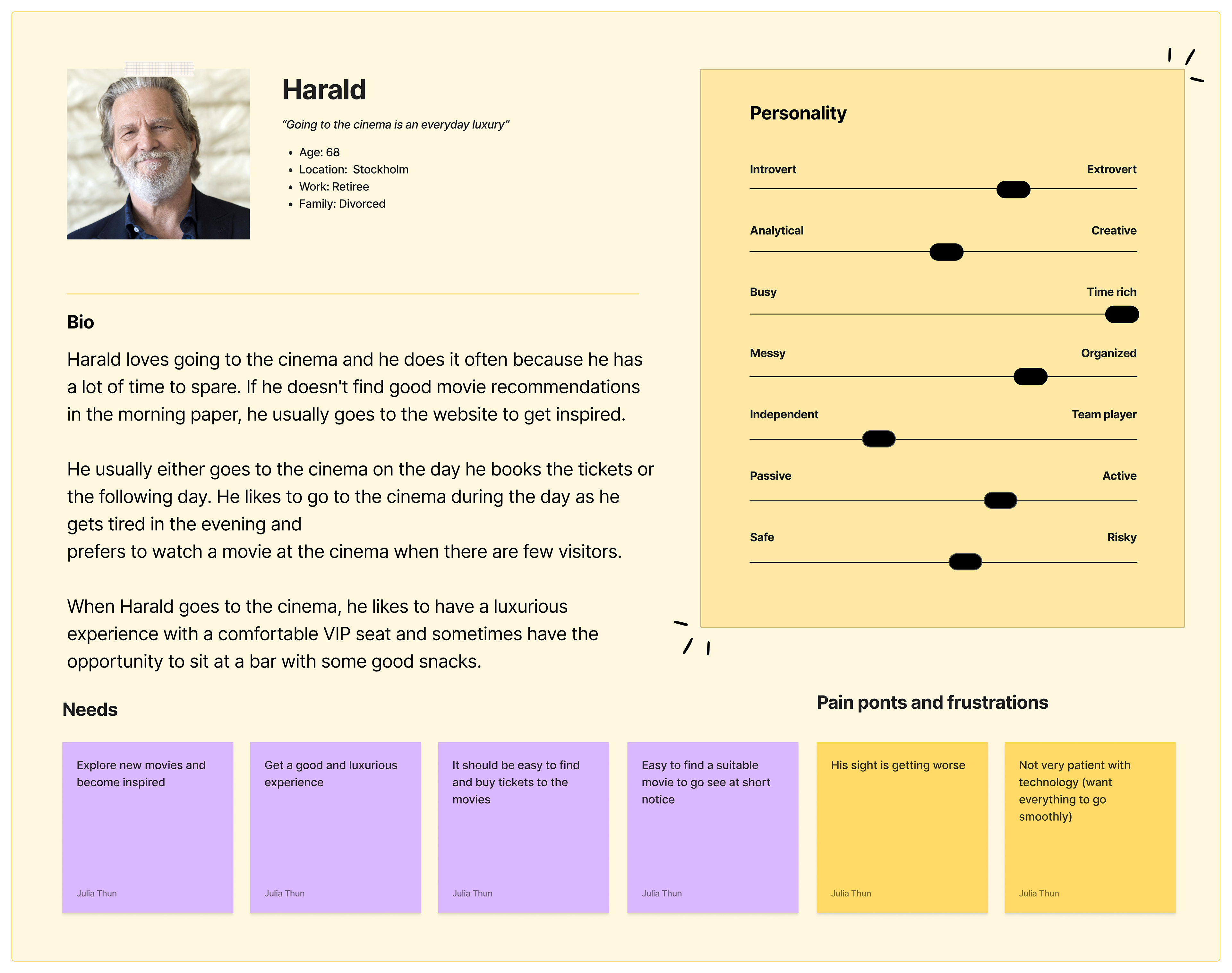
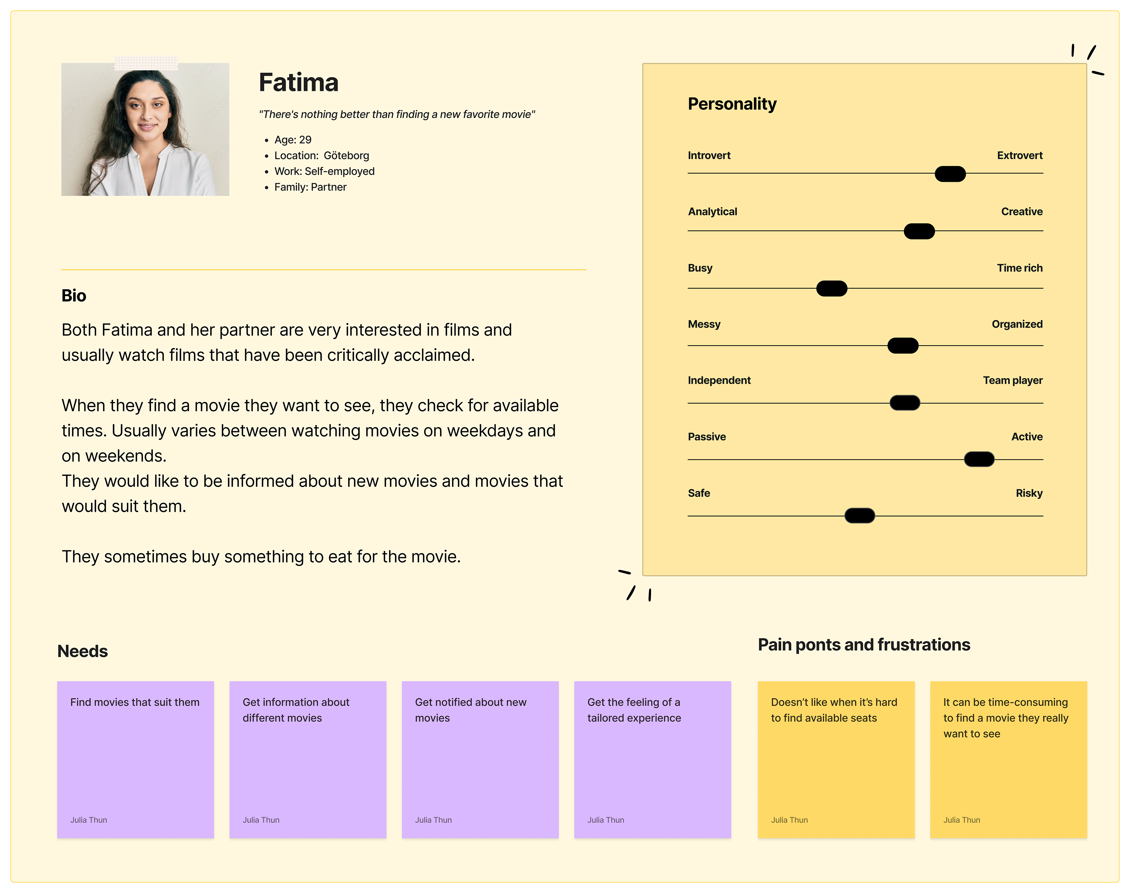
Based on the answers I collected from interviews and questionnaires, I was able to create a clearer picture of Regal's target group.
I created the following user personas:
I created the following user personas:
User journey maps
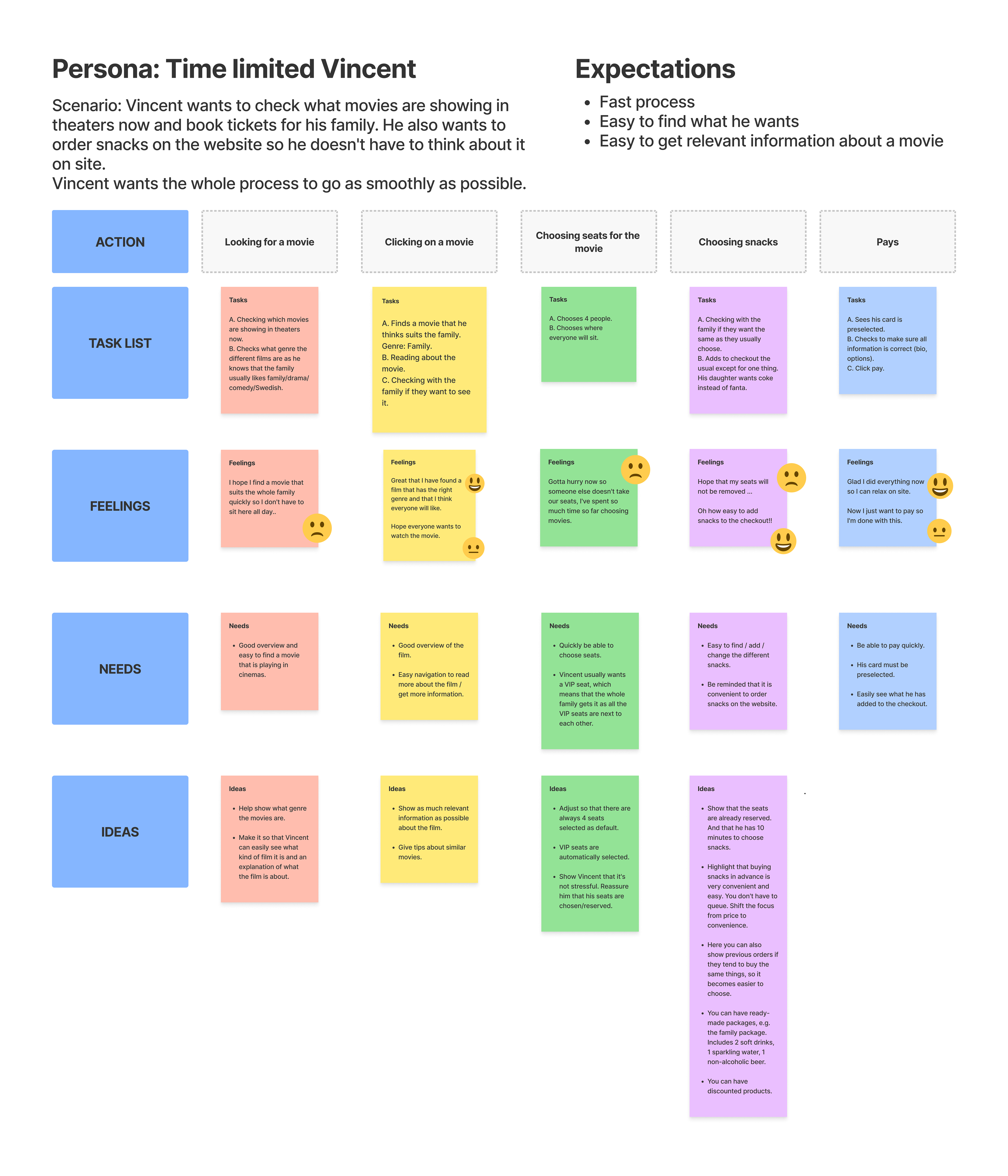
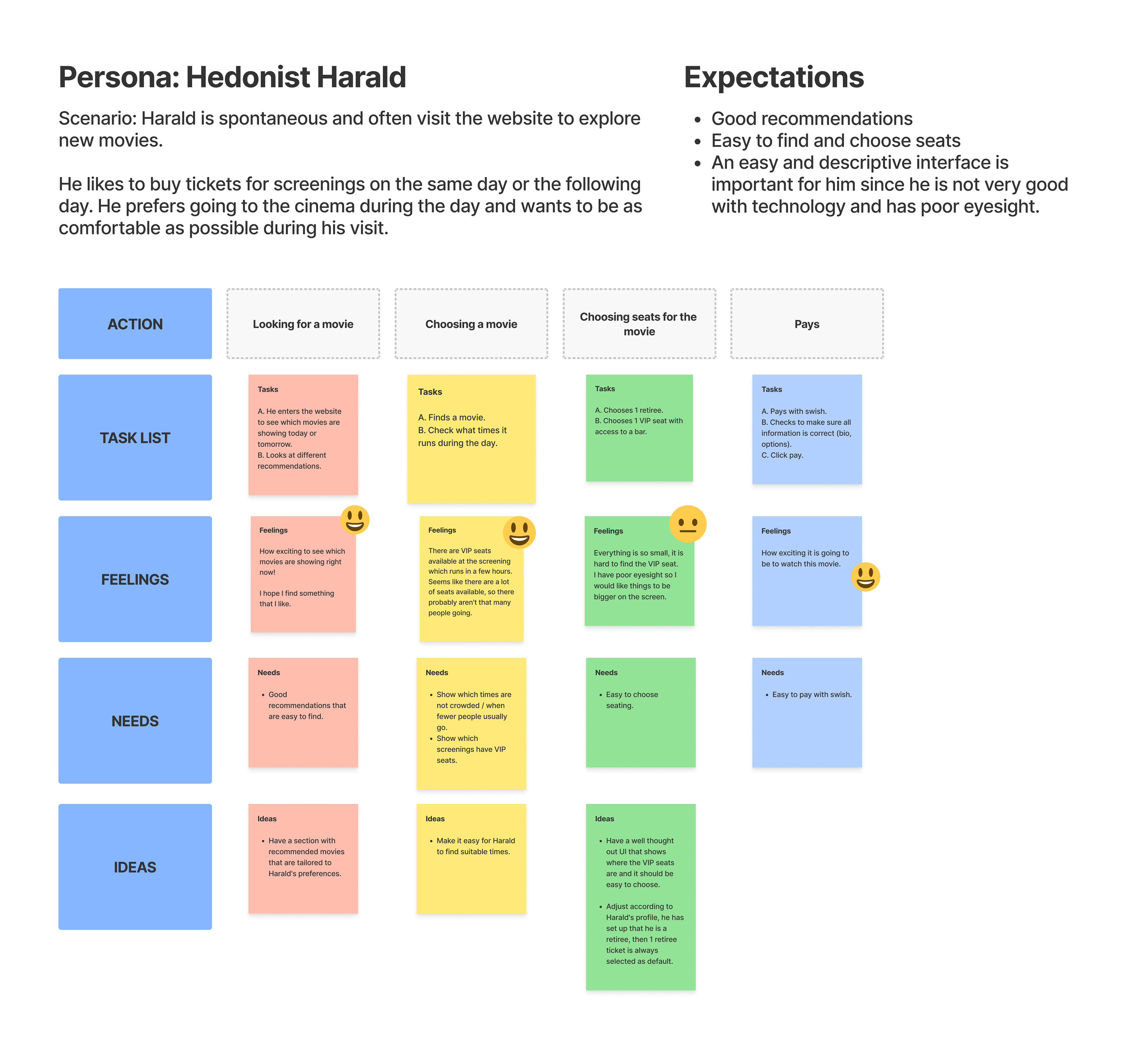
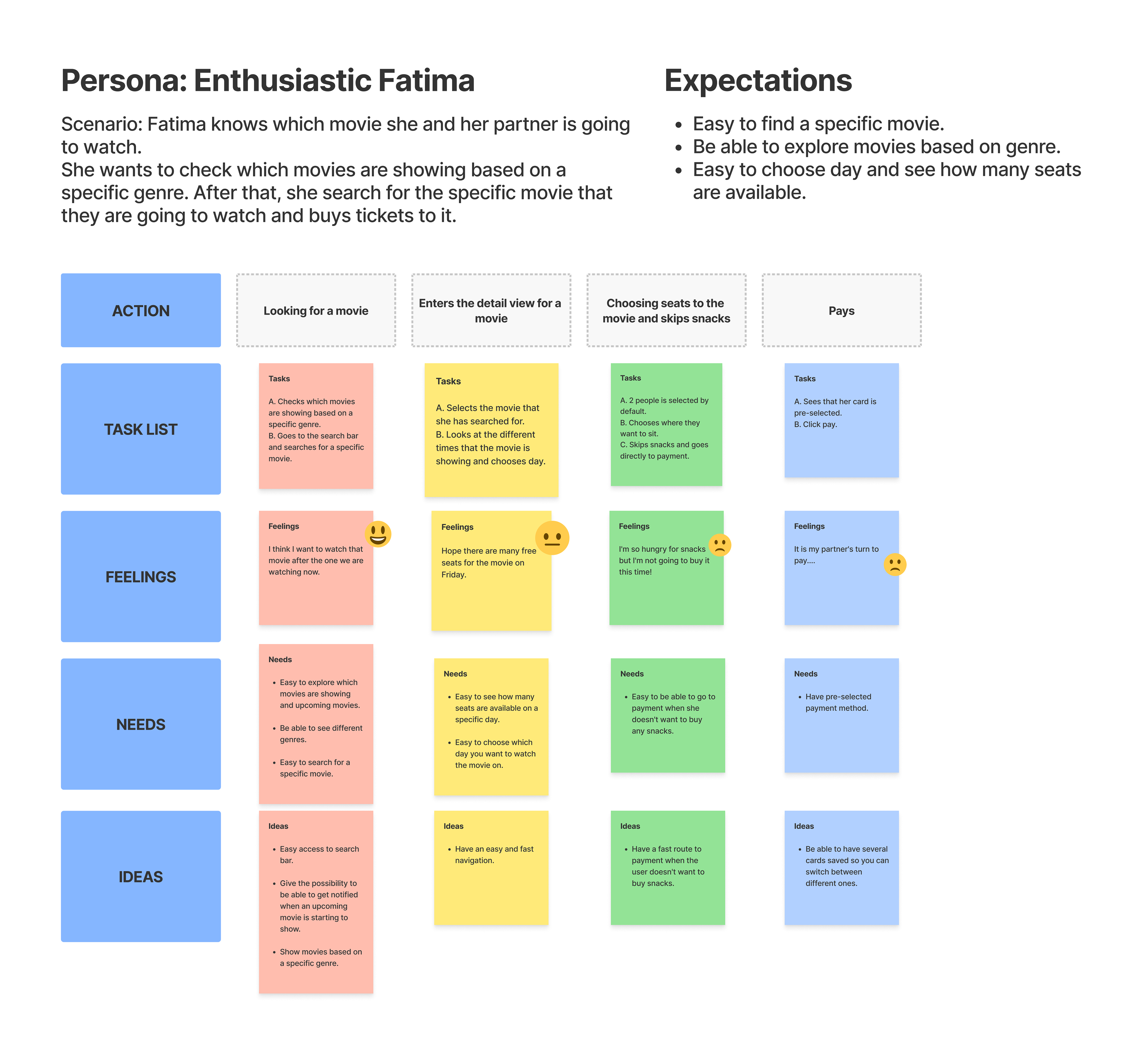
Based on that, I created user journey maps, to map and identify users' purchase journeys.
Ideation
After the user surveys, I started brainstorming ideas about which functions the website should have, how they should work and what should be prioritized.
To get a clear picture of how the website's structure might look, I created a dynamic sitemap:
To get a clear picture of how the website's structure might look, I created a dynamic sitemap:
Wireframes
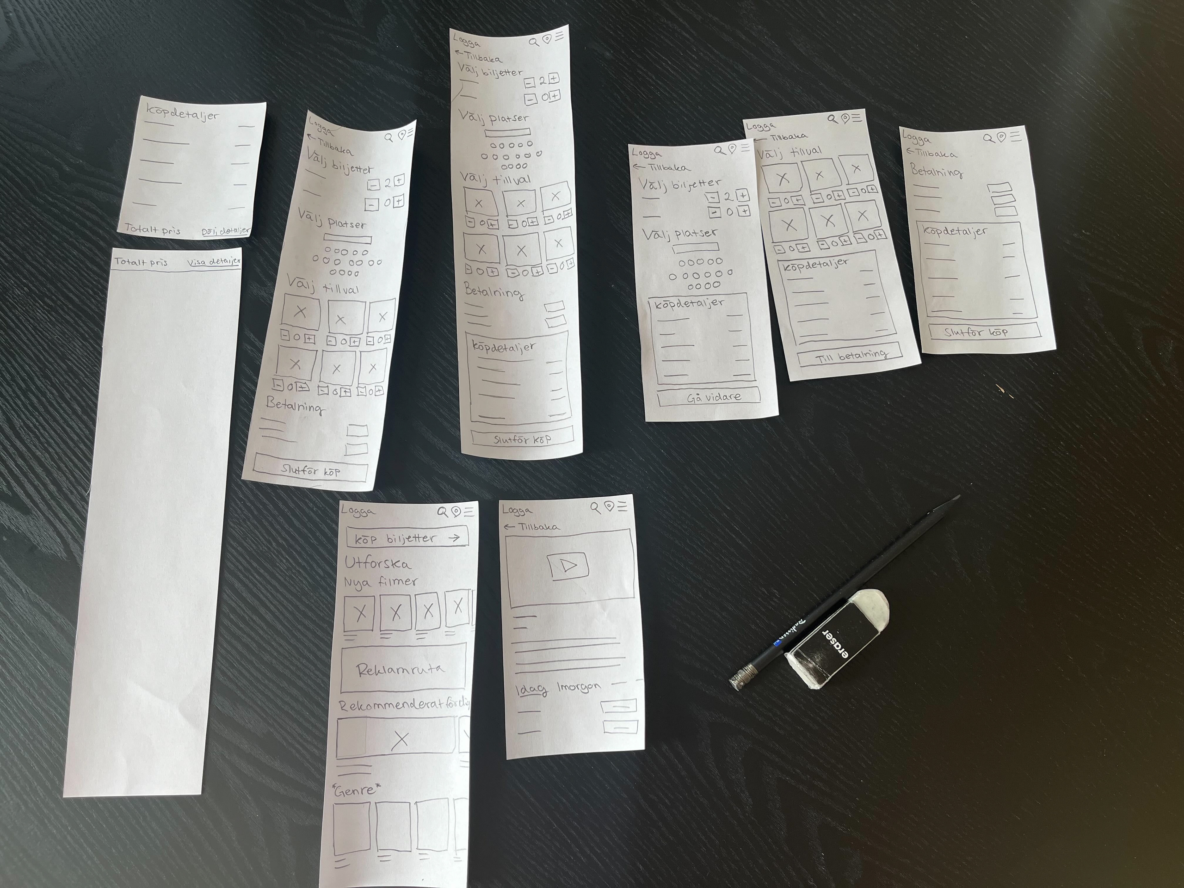
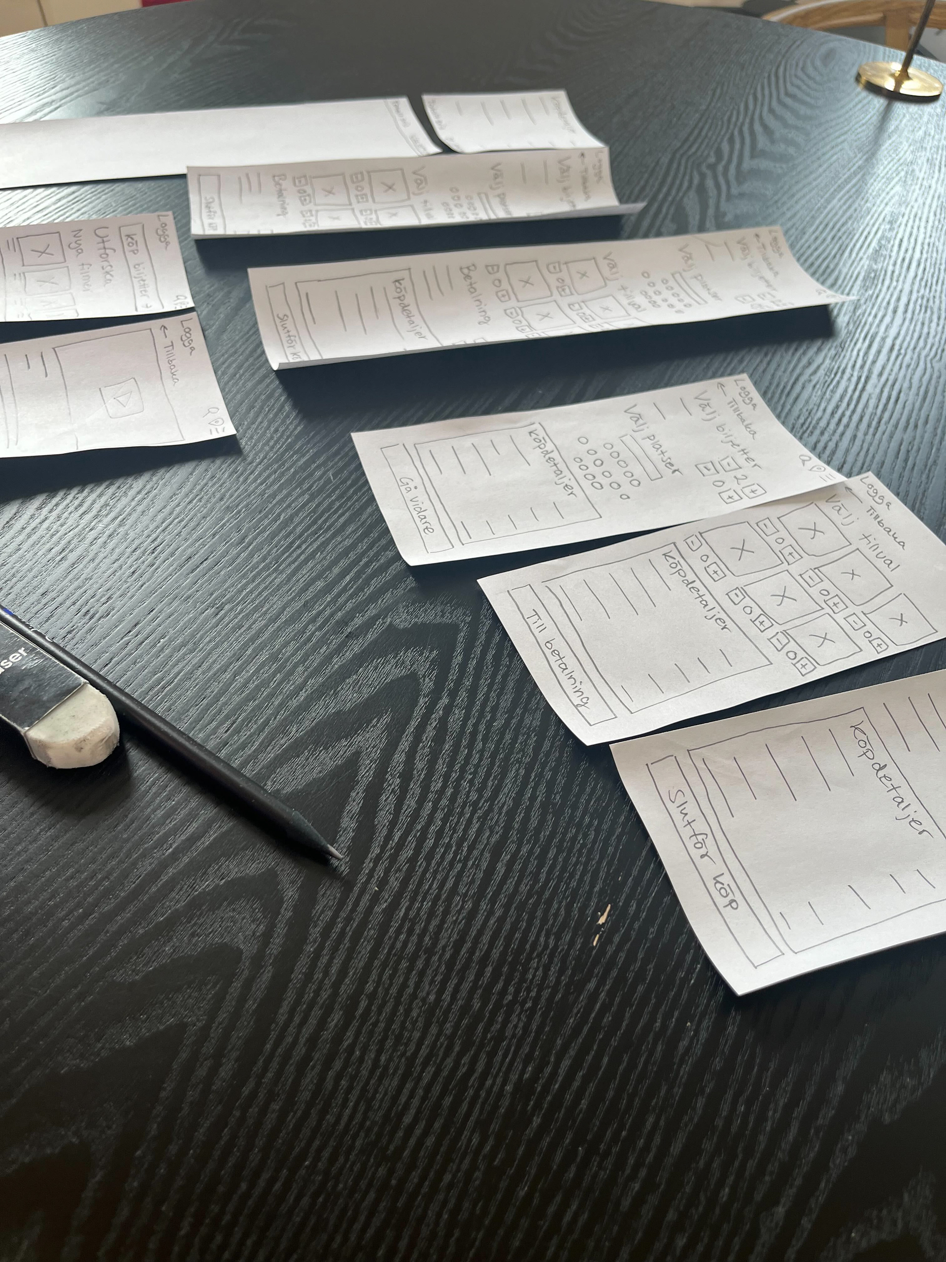
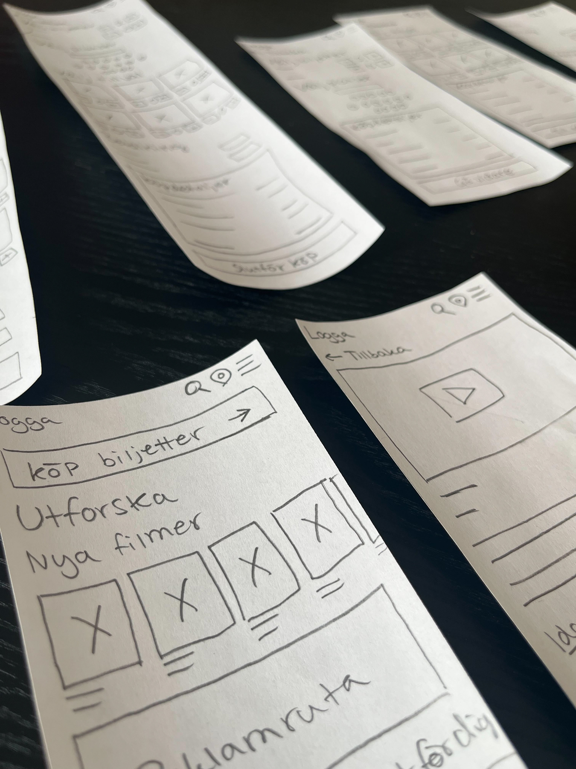
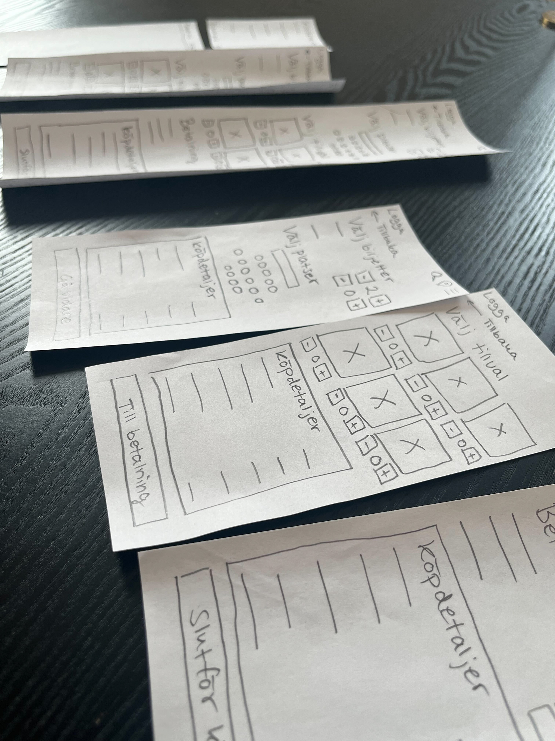
Drawing wireframes allowed me to identify potential solutions, areas that required improvement, and elements that were not feasible.
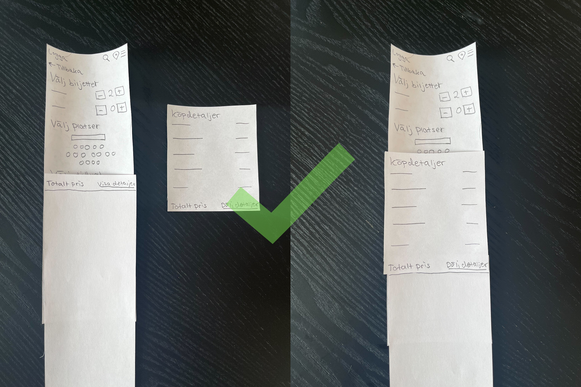
Consumer Buying Process
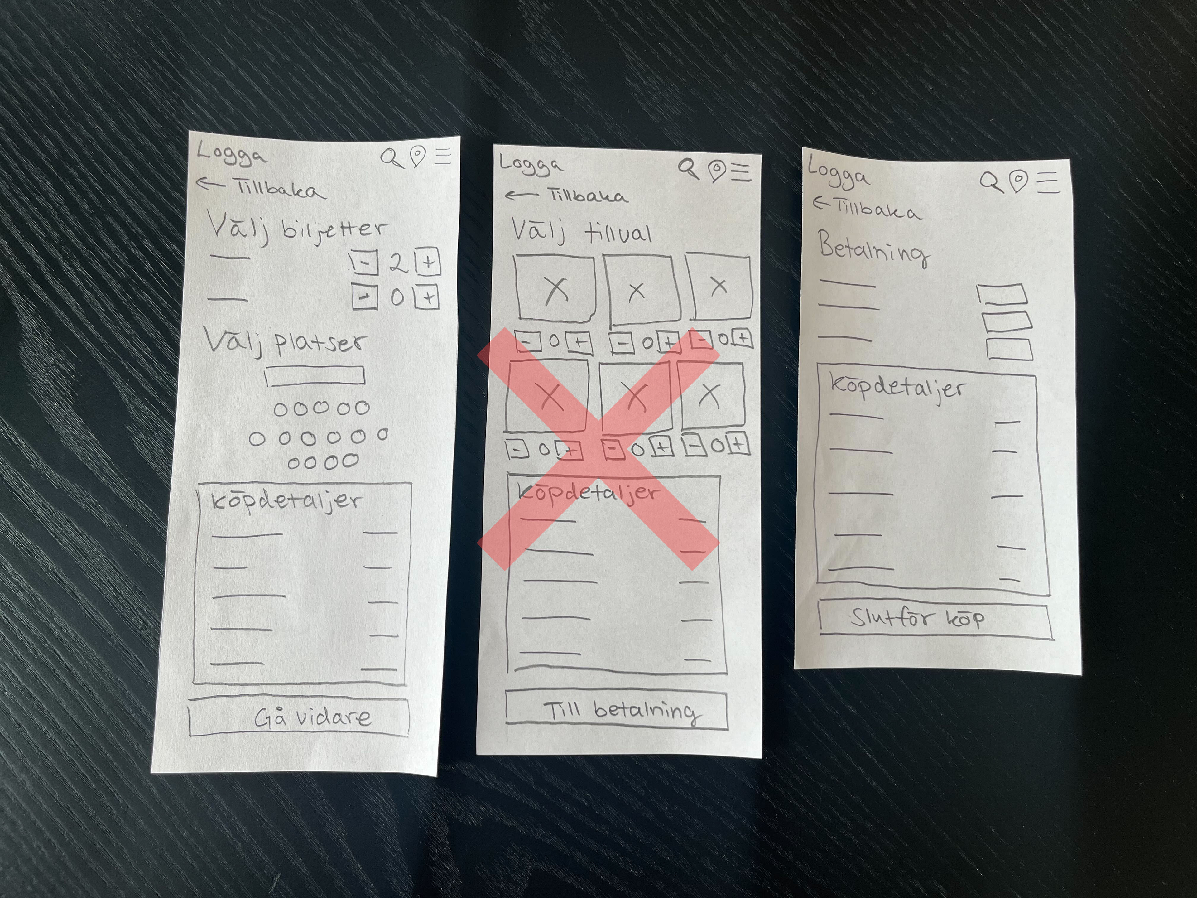
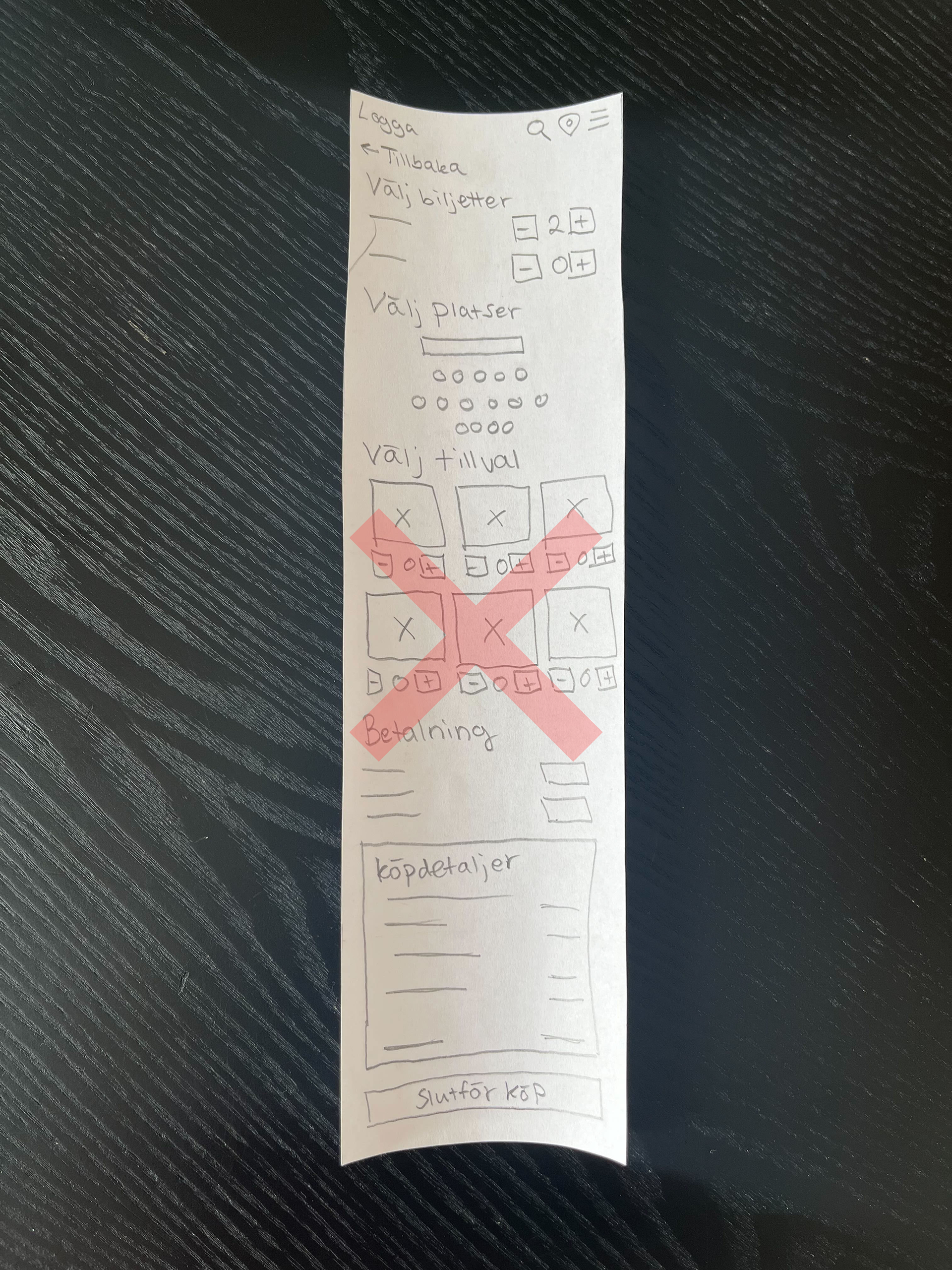
Among other things, the buying process and how it should work was analysed. The goal was to create a smooth and fast process but at the same time give the user a good overview and also the opportunity to add various options to their purchase.
Prototyping and Testing
When I was done with the wireframes, I created simple interactive prototypes in Figma using the best examples from the ideation phase.
I tested the interactive prototypes on users to get feedback and be able to improve the service in an iterative process.
Through various user tests, I was able to improve and design the service to suit Regal's target audience and their behavior patterns.
I tested the interactive prototypes on users to get feedback and be able to improve the service in an iterative process.
Through various user tests, I was able to improve and design the service to suit Regal's target audience and their behavior patterns.
Results
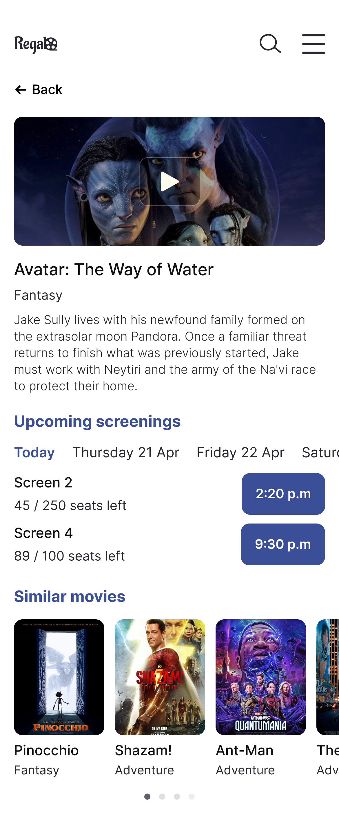
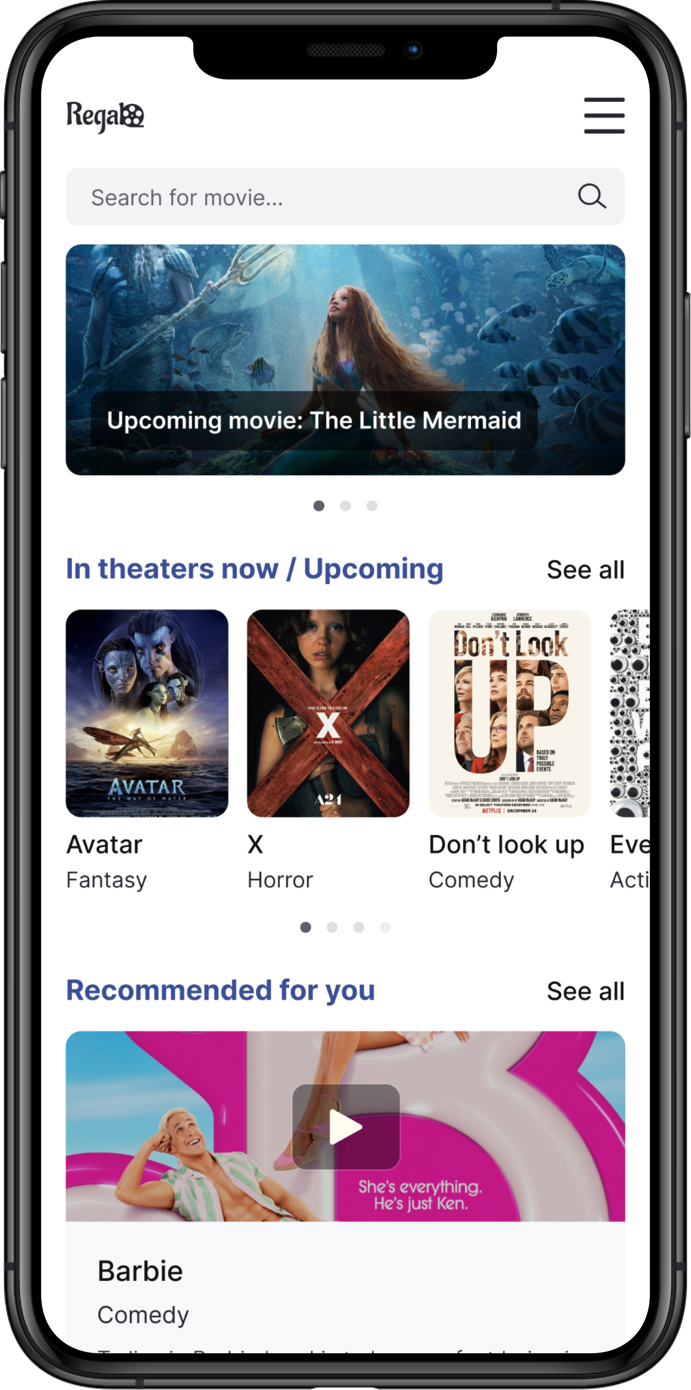
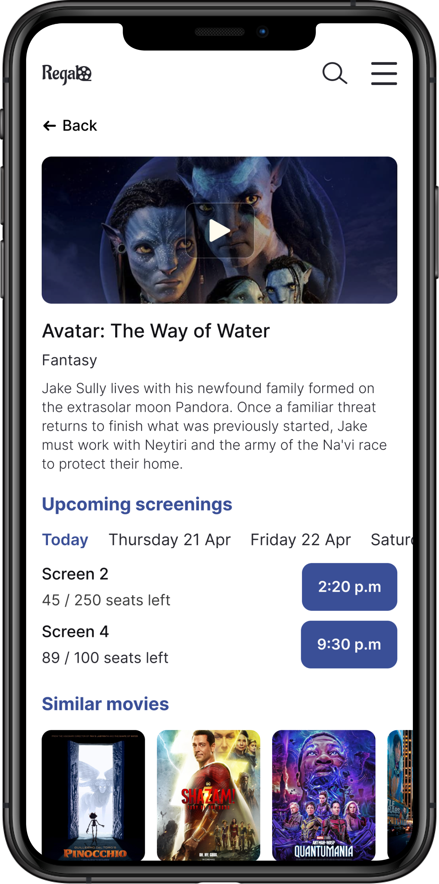
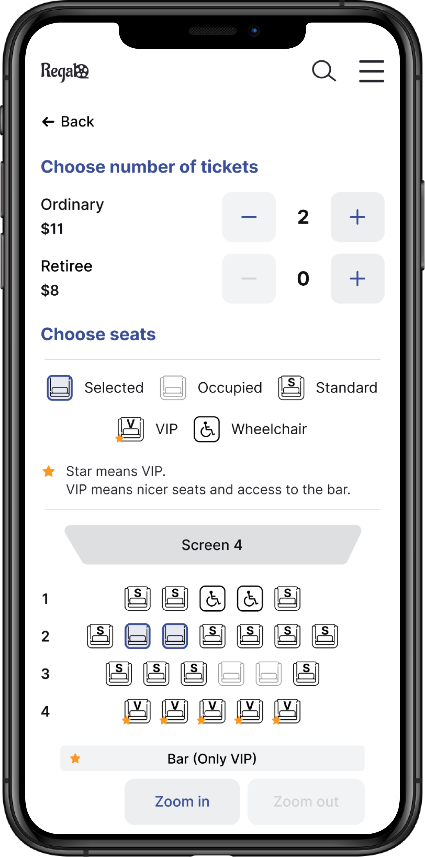
Upon completing a productive iterative process, I obtained the following outcomes:


